Less Than Kind
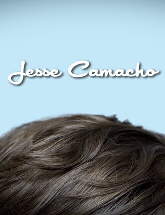
Here some frames I pitched for the Season 3 title design for Less Than Kind (didn’t get it BTW). But I was really happy with them, so here they are. I’m particularly fond of the palette, which reminds me of the killer colour scheme’s Fender was rolling out on their guitars in the 60’s.
A little background on the show: Less Than Kind is an HBO Canada show set in Winnipeg. It focuses on an awkward and overweigh teen named Sheldon who is struggling to manage his dysfunctional family in the midst of the trying to grow up. My concept for the piece was to embody all of Sheldon’s challenges as ill-fitting tuxedo. He’s nearing adulthood, discovering love and the world’s expectations of him, but his family is crazy and nothing fits quite right.
My colleague Mr. Ian Tucker deservses to take a bow — he was my stand-in for the shoot and didn’t even bat an eye when I appeared with a rented powder-blue tux for him to put on.


You must be logged in to post a comment.